Maps of the 2008 US presidential election results
Election results by state
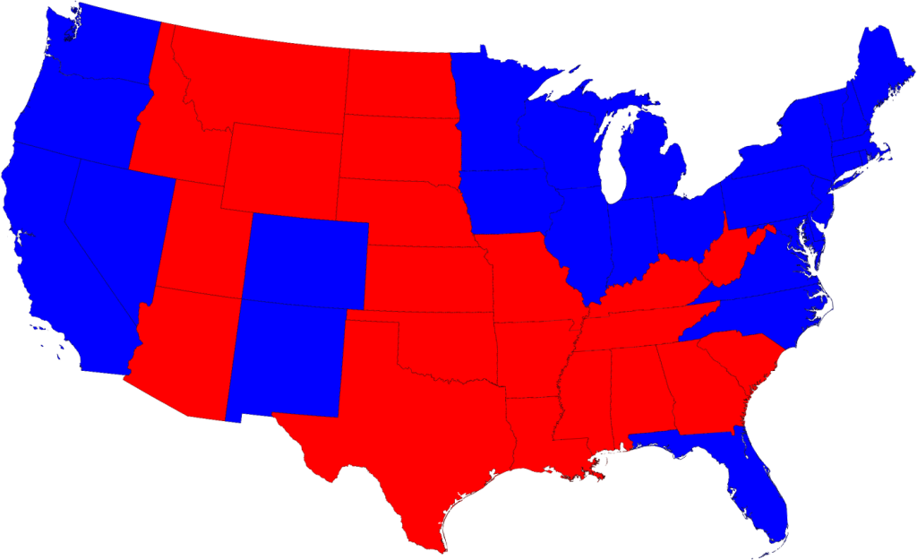
Most of us are, by now, familiar with the maps the TV channels and web sites use to show the results of the presidential election:
Click on any of the maps for a larger picture
The states are colored red or blue to indicate whether a majority of their voters voted for the Republican candidate, John McCain, or the Democratic candidate, Barack Obama, respectively. Looking at this map it gives the impression that the Republicans won the election handily, since there is rather more red on the map than there is blue. In fact, however, the reverse is true – the Democrats won by a substantial margin. The explanation for this apparent paradox, as pointed out by many people, is that the map fails to take account of the population distribution. It fails to allow for the fact that the population of the red states is on average significantly lower than that of the blue ones. The blue may be small in area, but they represent a large number of voters, which is what matters in an election.
We can correct for this by making use of a cartogram, a map in which the sizes of states are rescaled according to their population. That is, states are drawn with size proportional not to their acreage but to the number of their inhabitants, states with more people appearing larger than states with fewer, regardless of their actual area on the ground. On such a map, for example, the state of Rhode Island, with its 1.1 million inhabitants, would appear about twice the size of Wyoming, which has half a million, even though Wyoming has 60 times the acreage of Rhode Island.
Here are the 2008 presidential election results on a population cartogram of this type:
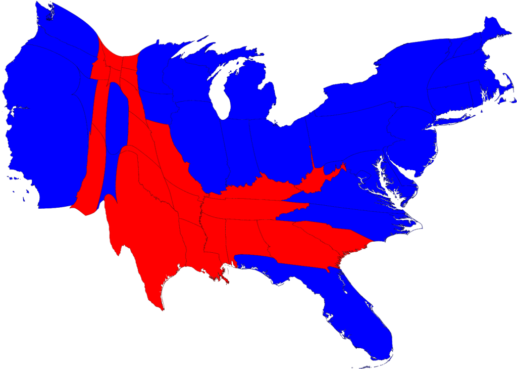
As you can see, the states have been stretched and squashed, some of them substantially, to give them the appropriate sizes, though it's done in such a way as to preserve the general appearance of the map, so far as that's possible. On this map there is now clearly more blue than red.
The presidential election, however, is not actually decided on the basis of the number of people who vote for each candidate but on the basis of the electoral college. Under the US electoral system, each state in the union contributes a certain number of electors to the electoral college, who vote according to the majority in their state. The candidate receiving a majority of the votes in the electoral college wins the election. The electors are apportioned roughly according to states' populations, as measured by the census, but with a small but deliberate bias in favor of smaller states.
Tidak ada komentar:
Posting Komentar